Analysis revealed that 30% of users misunderstood the ‘Services’ feature, often using it as a ‘Task tracker’ and failing to connect it with other features.
Business wants to attract the beauty industry, but we had to make sure the product worked for other sectors as well. The focus was on the main service flow, which ends with a payment.
We were asked to deliver the first MVP in two weeks, taking into account the work from both design and tech teams.
The ‘Services’ was one of the first features built at the company, making it difficult to adapt to modern requirements. Requiring close work with the Tech Team.
To ensure this feature resonated with users, we conducted comprehensive research using tools like Hotjar, customer insights, competitive analysis, and platform heuristics. This approach enabled us to discover user needs, identify opportunities for improvement, and strategically develop the MVP to maximize its value.

After presenting research, we used Lean UX principles and the MoSCoW framework to prioritize functional requirements. Our brainstorming session focused on crafting efficient solutions to meet user needs quickly.

We mapped a user flow to clarify how ‘Services’ and ‘Sales’ connect, helping us prioritize key functionalities. I also created Notion templates to track progress and manage delays caused by changes or blockers.


Of increase the number of users linking ‘Deals’ with at least two other feature (e.g., Time Tracking and Invoices)
Of reduce support tickets related to ‘Deals’ misunderstandings in the first quarter.
Achieve a rise in daily active users engaging with ‘Deals’ within the first quarter.
We decided to use a side-window for deal details and creating new ones, making the user learning curve easier. From the general search bar, users could access any detail from any function. Users could also review service details related to other functions through side tabs. We simplified the data input process so users could easily customize it.


We transformed ‘Inventory’ into ‘Products & Services,’ we provided better cost transparency for end-users and improved sales control. We also optimized ‘Scheduling’ to enhance tracking on the calendar view and automate service reminders.

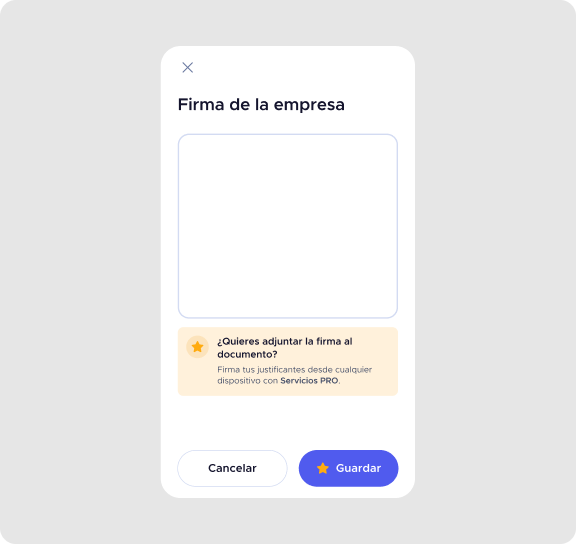
We redesigned this section to improve flexibility, allowing users to control data visibility, add comments, and attach files to showcase service results. We also introduced a signature block to support diverse industry needs.


To optimize the project, we centralized all marketing and design deliverables in Figma, so the development team only had one document to review during releases.

For the next release, we launched actions connected to the end of a service process: Cancel and Pay service. The payment option led to a ‘’Sales” process, integrated with Stripe. This launch have a ‘Payments’ section.
A clearer technical architecture from the beginning to better understand blockers, data availability, and feature dependencies.
A project lead to provide alignment and facilitate decision-making, ensuring smoother prioritization.
More structured collaboration with the tech team to anticipate limitations and refine the scope earlier.
The research phase uncovered opportunities beyond the initial scope, leading us to explore Payments, Invoices, and Calendar features. My teammate worked on the Calendar so it could launch alongside Deals.
Identifying user needs led to proposing an Online Booking feature, connecting a customer-facing landing page with the admin platform.
Navigating a complex project without a lead reinforced the importance of proactive communication and cross-functional alignment.
This project opened the door for me to work on Payments, where I joined meetings to understand integrations with the platform and payment terminals.