OOB Life
Tags
Brand
Product Design
Redesign
Role
UX/UI Designer Consultant
Year
2019
Problem
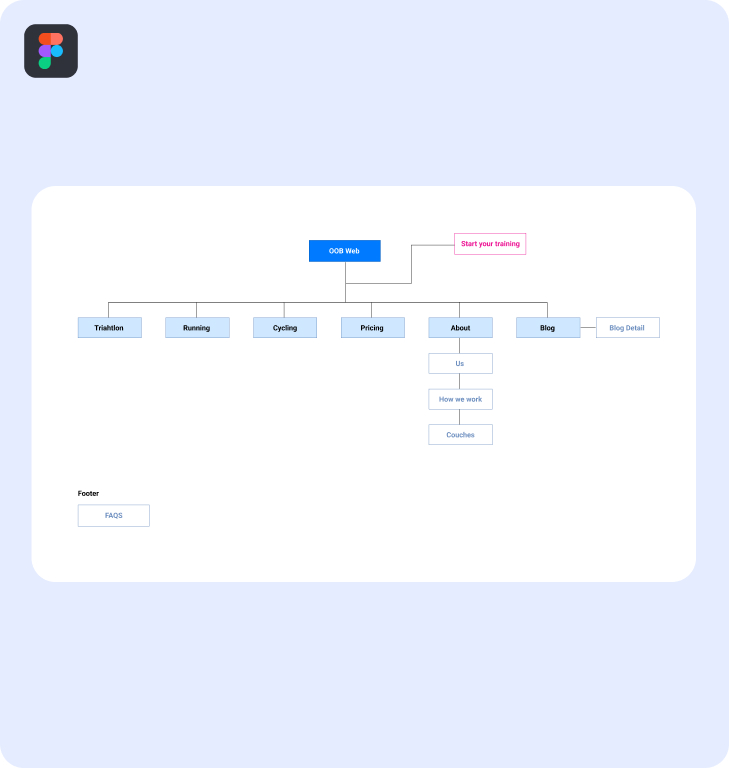
The client requested a UI refresh to better communicate their services. After reviewing the site, I found the sitemap was poorly structured, making it hard for users to navigate and understand the services.

Challenges

⚙️

Information Architecture

The client wanted to present all of their services and blog content, but the website was cluttered with multiple information blocks spread across different sections, lacking clear prioritization and structure. This made it difficult for users to navigate and find key information.

😨

Uncertainty

Limited communication with the developer meant there was uncertainty about what was possible in terms of graphics and animations. This lack of clarity made it harder to ensure the design vision matched what could be implemented.

Process
After a meeting with the client and the website analysis, I understood that the project needed more than a UI Refresh. Some highlights of the process was:

1. A sitemap: To express and have better structure of what we want to communicate.

2. Wireframing: To iterate the structure of what we are saying and to define what need more hierarchy.

3. Visual exercises: To find what expresses more the ‘new identity’ of the brand and be more dynamic with the communication.
Design decisions
In this stage, I delved into typography to find a suitable style that reflects the sector’s atmosphere. Next, I established the color palette and began organizing the homepage. Also, I’ve chosen to incorporate large images in key areas of the website to convey a sporty vibe, add a human touch to the brand, and resonate with our target audience.

Finally, to have a stronger effect, I enhanced the brand’s colors, established a photography style and icons, and merged them with the new colors.

This project is getting a makeover! Check back soon!