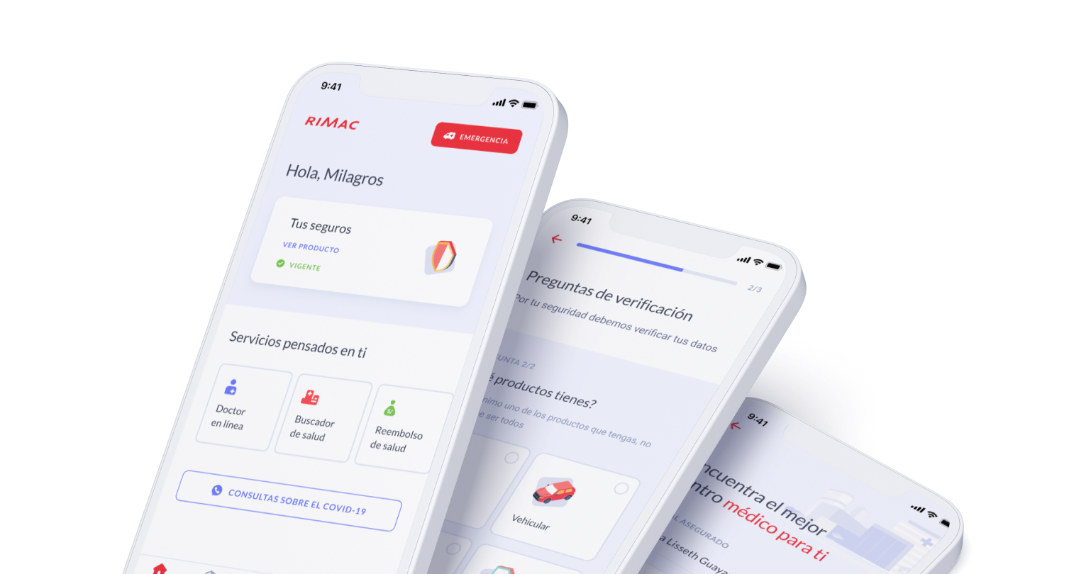
Rimac had no mobile app. Their target users — people managing life insurance, claims, and emergencies — had to call support for everything. The Service Design team confirmed what was obvious: users needed to do this on their phone, on their own, without waiting.
Create the first native versions for Android and iOS — no existing mobile foundation to build on
Limited access to technical data that could affect the app, especially while it was in beta
Difficulties accessing features on mobile that were considered important for users
Without direct user access, I analysed the existing flows using heuristics and gathered requirements from the Service Design team and with the UX designer we conducted a few interviews to validate the understanding of teh flows.
Users are Rimac's customers — people managing life insurance on their own. Many are not tech-savvy and rely on the app to handle urgent situations like claims and emergencies without calling support.
The team includes the Service Design team who owned research, and the product and engineering team working under a fixed two-month deadline.
Before committing to the final structure, we explored two directions:
Adapt the existing web experience for mobile. Rejected: interaction patterns didn't translate to touch, and the information architecture was too complex for a small screen.
One unified flow covering all insurance types. Rejected: users came with a specific task. Separate, focused flows won.
Goals set at project start.
To deliver the Android & iOS version. Hard deadline, no flexibility Goals set at project start
Operators complete setup faster using templates instead of starting from scratch.
From the beginning of the project we decide to create a scalable foundation to develop our task in a faster way.
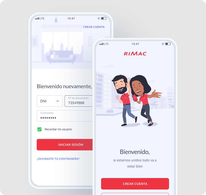
Added a show/hide toggle on the password field. Many Rimac users are not digital natives — small friction points like hidden passwords cause drop-off at login. This was one of the first decisions we made to build trust from the start.
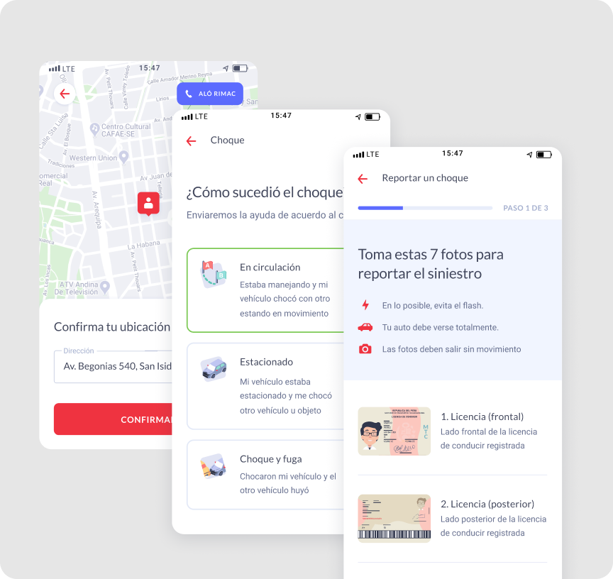
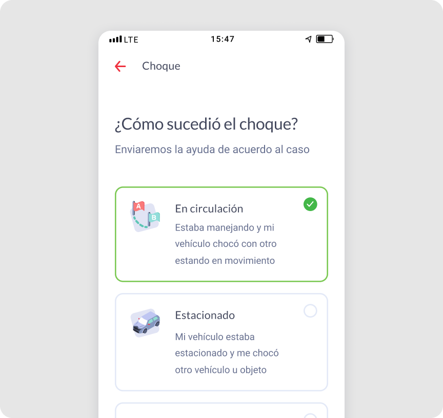
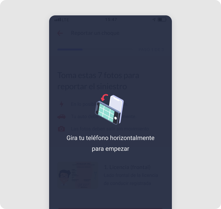
The claims process requires document uploads. Instead of a single upload screen, we designed a step-by-step flow with clear status feedback at each stage. Users always knew where they were, what was missing, and what came next. This reduced confusion and support contacts during the claims process.
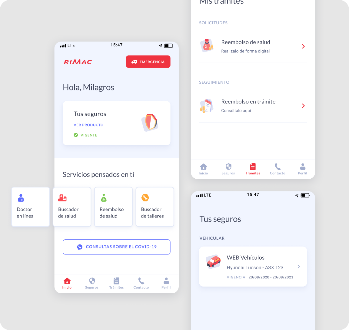
Two months to launch. We prioritized the 3 flows users needed most:
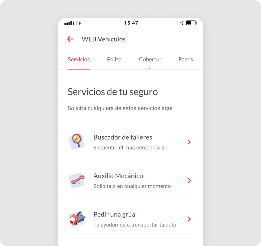
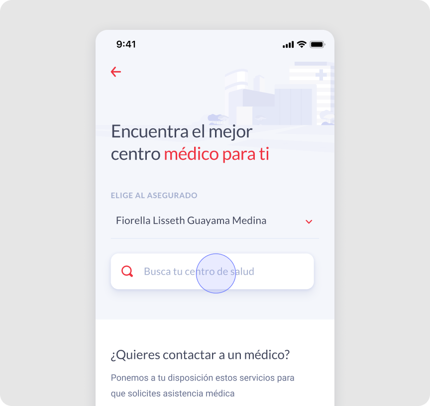
1. Health provider search: find nearby doctors and clinics
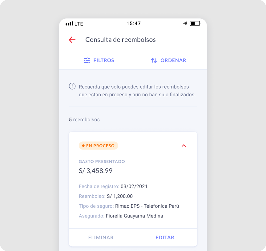
2. Health reimbursements: submit and track medical expense claims
3. Workshop finder: locate authorized car repair workshops
Everything outside these three flows was deferred to a future version.
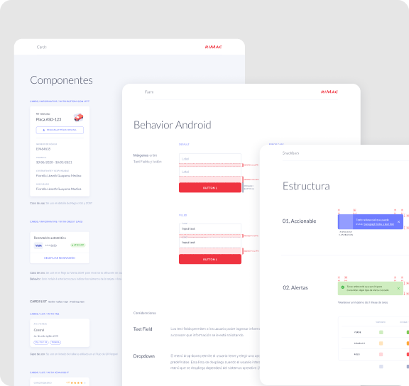
There was no existing mobile system to inherit. I built the component library aligned to iOS and Android guidelines from week one — buttons, forms, states, and navigation patterns. This gave engineering a consistent reference and made both platforms feel like one product.
Defined visual styles early — before the full brief was locked. This gave the team a reference point from week one and avoided inconsistencies later in the process
Worked closely with the UX Designer to align flows and complete use cases — while she focused on mapping a new feature in parallel. Used the Microinteractions Tracking Figma file to keep both platforms in sync and avoid inconsistencies during development.
Proposed and built shared components proactively — this reduced back-and-forth during handoff and gave engineering a single source of truth throughout the project
The documentation I prepared before handoff was used directly to put together the Design System and ship it with the final product
Launched on time across iOS and Android — two months, no prior native experience
The component system held up — engineering picked it up fast with minimal back-and-forth
Self-service flows reduced the most common support call reasons from day one
The ambulance tracking screen was designed with limited real data — edge cases created confusion we hadn't anticipated. I'd stress-test with real scenarios earlier
Accessibility was addressed reactively — next time I'd run usability sessions with older users specifically from the start
Native platform constraints are design constraints — iOS/Android guidelines are a starting point, not a limitation
A hard deadline forces scope clarity faster than any prioritisation framework
Building the design system in parallel with the product saved more time than it cost
When you're new to a platform, document everything — your notes become the team's reference